ShopDreamUp AI ArtDreamUp
Deviation Actions


Suggested Deviants


Suggested Collections


You Might Like…


Description
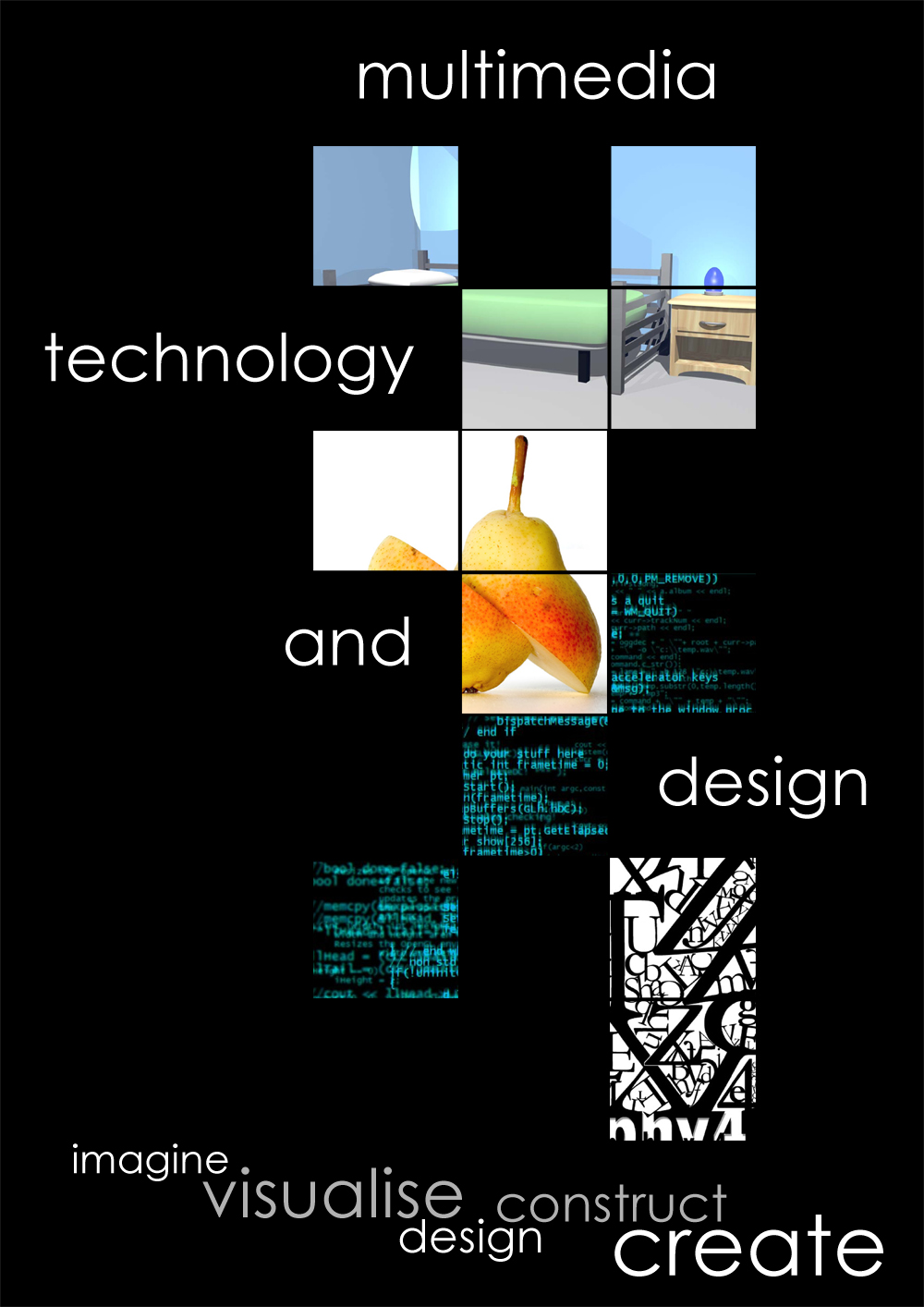
As part of the digital photography module, we had to design a poster that advertises the BSc (Hons) Multimedia Technology & Design degree at the University of Kent, Canterbury. Although I don't use much photography, I was focusing more on the communication and design of the whole thing. I'll paste my report below. It came out quite nice printed in A1 and the feedback I got from them was that they could see it advertising the course... so, that's nice, well it's always nice.
Anyways, enjoy.
---
I came up with the idea of using squares after thinking about how we look through a window. Wooden panes within a window often cut up the view we are seeing out of it, however, our brain can work out what the view should represent by using the information available and matching this to data in our heads (neural systems engineering in the second year!). I thought I would use this concept and apply it to my poster. However, I didn’t want the end result of the poster to be square, or the viewer to be able to put any shape on the finished product. I wanted an abstract feel, which would tie in with the “and design” aspect of the degree programme.
I knew it would be impossible for me to include every single thing covered on the MTD programme and I was pushing myself away from this approach as the whole poster would look a bit too busy. I want the viewer to be able to get a concept about the course within the first ten seconds or so… as the viewer may just be walking past the poster and turn his/her head once it catches their eyes. I wanted the meaning to be complex, however, at the same time, the communication of the message made easy to translate. I included four main aspects of the course that I enjoyed very much. Not to say that I didn’t enjoy the rest, I just wanted to bring across a little deviation in the context of subject modules. I wanted to make use of juxtaposition of completely different subject areas, and to make this clear. After all, Multimedia Technology and Design is a very wide diversity of different modules, that all come together in the final year.
The 3D render of a bedroom represents the 3D modelling aspect of the course, as to which is getting a bigger part of the degree each year thanks to some excellent teaching. This is again cut up in an abstract way via squares so the viewer can just see a little bit of the image but not the full picture. Underneath that is a photograph of a pear which has been sliced in half. This represents the Digital Photography module of the programme. The photograph itself is very abstract, individual, extremely creative, and somewhat new and experimental in the way it is sliced in half, which relates to the module itself – an experimental new module which is working quite well. Again, the viewer sees enough of the image to work out it’s a pear, and enough to see the way it is sliced. Under this is some high level C programming code. Random pastes from various projects. The programming side of the course is a big part these days and I wanted to show to the viewer that this degree is also indeed very technical as opposed to the first to images which are creative. Additionally, to get across that you can be creative in the way you programme. Again, this is sliced up in a way unlike the others; making the viewer’s eye travel diagonally down. To end it off, I have two squares of typography. This brings the viewer back to the creative and design side of the course. I wanted to communicate to the viewer that the degree is a journey, consisting of a diversity of different areas, but all these areas allow you to be unique and creative in your own way. This works extremely well I think as the typography is in juxtaposed with the technical programming squares. The point of the whole abstract approach to this was to let the viewer know that you have to use your brain and fill in the blank gaps yourself; in the way you feel they should be filled in. You travel the journey through the three years, but how you do it, and what you do, are up to you. The text “imagine, visualise, design, construct, create” at the bottom that I created sum up the whole journey; and at the end of that journey, that there isn’t really any end, it’s just more black blank gaps for you to do your own thing and be creative; i.e. a job.
PS. Thank you for the stock if I used it on this... I forget where I got it from, but if it's you, thank you... you were noted in the final thing.
Image size
1000x1414px 397.53 KB
© 2004 - 2024 c0redump
Comments11
Join the community to add your comment. Already a deviant? Log In
i like the idea